
Whether it’s a big change or a barely recognizable tweak, when a company changes its logo, people are going to notice — and odds are, some of those folks are going to hate it. Case in point: Amazon has redesigned its Prime logo ever so slightly, and many people are unsure how to feel about the change. [More]
logos
Instagram Put A Lot Of Thought Into Their New App Icon
By 5.11.16
When you open an app on your mobile phone or tablet, you do so by looking for and gently tapping on its icon. If you use a given app frequently, it can be disorienting to have its icon change. Today Instagram, the super-popular app that you use to browse photos of your friends’ brunches, their cats, and their cats’ brunches, changed their logo and app icon. They took a lot of care to make sure that the design is fresh, but familiar enough that it’s instantly recognizable. [More]
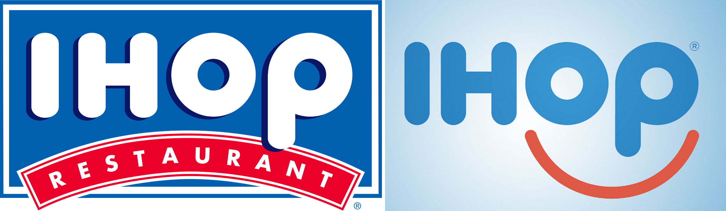
IHOP Changes Logo For First Time In 20 Years Because The Old Version Was Too Frowny
By 6.1.15
In a move that literally turns a frown upside down, IHOP has changed its logo for the first time in 20 years. Partly because the old version used a red swoop that was just a bit too sad. [More]
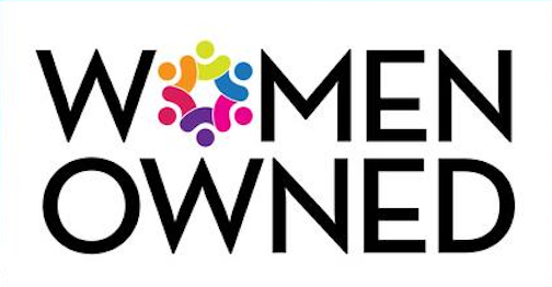
Walmart’s “Women-Owned” Campaign Officially Launches In Stores & Online
By 3.12.15
Last June Walmart said it would work to bring awareness to women-led companies by sticking “women-owned” labels on a range of products in its stores. While the retailer initially planned to start the campaign last fall, it finally appears to be getting around to it this month. [More]
Hershey Joins Elite Club Of Companies With Poo-Like Logos
By 8.28.14
Hershey decision to redesign the company logo to look more chocolaty was probably well-intentioned. But as they say, the road to hell is paved with good intentions… and littered with poo from jerks who don’t pick up after their dogs. [More]
Abercrombie & Fitch Ditching Logo-Heavy Clothing Because That Is So Last Decade
By 8.28.14
The halls of middle schools everywhere will be changed with this bit of news: Abercrombie & Fitch is scaling back the number of clothing items adorned with its once popular logo. [More]

Yahoo! Pitting 30 New Logos Against Each Other In Continuing Battle For Brand Relevance
By 8.7.13
Gather round, ye hipsters and ye tech-savvy young things! Yahoo! wants you to know that it’s cool and awesome and so much fun and to do that, it’s going to debut a new logo. But not like old, boring companies have done in the past. Nope! It’s going to take 30 days to do so, in the hopes that showing 30 different possible logos will prove exciting to consumers instead of just an endless train of logos. [More]
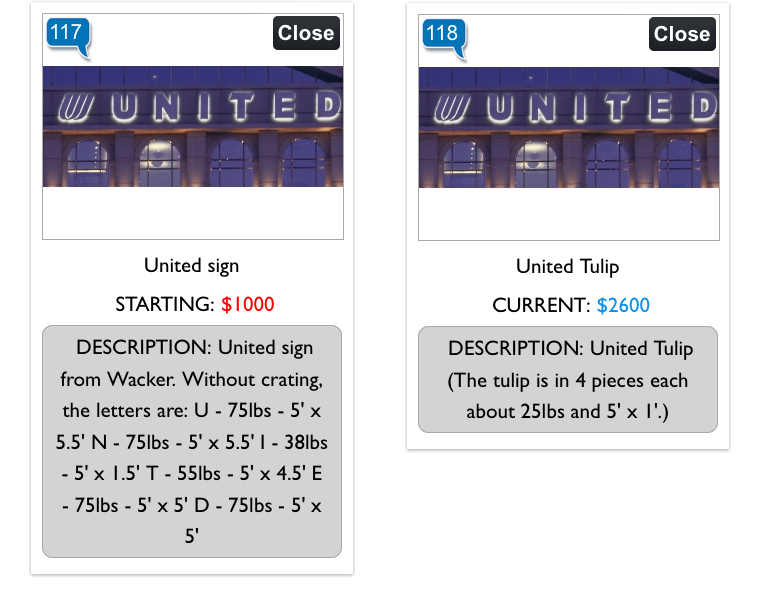
You Can Bid On Logo And Name From Former United Airlines HQ
By 6.28.13
United Airlines hasn’t just changed its logo in the wake of its merger with Continental; it’s also moved to a new office. And since the huge UNITED logo sitting on the former office building is now out-of-date, why not auction it off for a good cause? [More]

Federal Judge Rules That Political Activists Can Use Company Logos
By 5.11.11
Political activists who use company trademarks to protest business practices often face lawsuits from offended organizations, but a ruling by a federal judge in Utah may stifle such suits because they violate First Amendment rights. [More]
Logos Redesigned For What The Company Actually Does
By 5.4.11
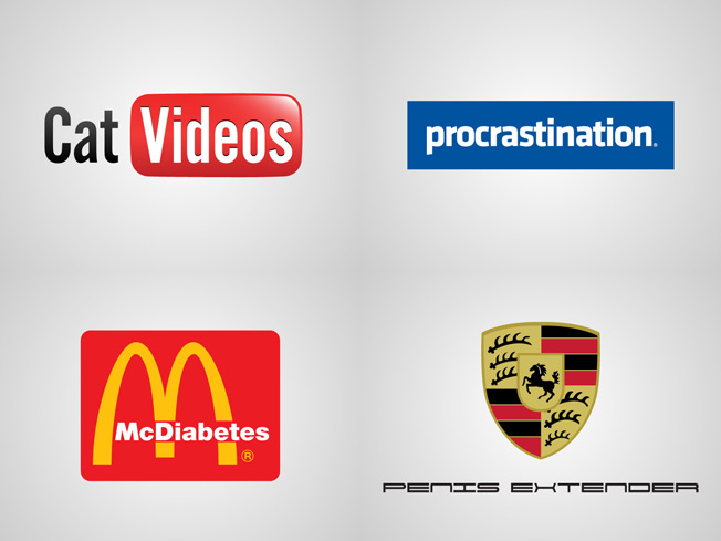
For fun and whimsy, graphic designer Viktor Hertz took a crack at reworking some famous company logos so they more accurately depict what the company is all about. C’mon, let’s get real people. YouTube is not about putting “you” on the “tube” — it’s the world’s largest repository of cat videos! The rest of the satire, more of which can be found here, speaks for itself. [More]

Urban Outfitters Unveils Snazzy New Logo
By 11.10.10
Perhaps jealous of all the publicity The Gap received when it unveiled its dopey, short-lived new logo, Urban Outfitters unveiled this beauty of its own. [More]
Gap Scraps Crap Logo
By 10.12.10
This might be some kind of record. Only a few days after The Gap unleashed its spare new logo to a rousing chorus of boos, the clothing retailer has backtracked and ditched the updated branding entirely. [More]

To Make A Good Lady Logo, Choose A Squiggle, Tree, Ribbon, Or Spiral
By 9.22.10
If you’re going to make a logo for some kind of lady group, you have four leitmotifs to choose from: squiggle, tree, ribbon or spiral. In her entirely .jpg-based essay, artist Shana Moutlon looks at how we reinforce gender stereotypes through bad logo design. [More]
"Elite" Shoppers Ignore Logos, Focus On Subtle Signals
By 7.31.10
Listen hun, your Gucci bag and Burbury scarf aren’t fooling anyone. Sophisticated shoppers, the ones you’re pretending to be, they know better. According to a recent study, the elite among us skip past the logos and instead focus on subtle cues like distinctive designs and details to figure out who’s truly high brow. [More]

World's Worst Logos
By 10.2.09
As part of our stand against Christmas Creep, we want to celebrate the actual upcoming holiday by lobbing some pretty frightening images at you from the website Your Logo Makes Me Barf. Take this alarm sign, for instance. The obvious chills come from recognizing what they’re walking into, but then you notice the kid figure and the term “young alarm” and, wait, wtf?

Flickr People Really Don't Like The New "From Yahoo!" Logo
By 9.24.09
You may have noticed that Flickr recently updated their logo to include “From Yahoo!” If you’re at all familiar with Flickr, you can probably guess how well this is going over with the users.
Target Advertises To Overhead Planes, Orbiting Satellites, Alien Life Forms
By 5.12.09
Joshua sent us this link to the Google Maps aerial view of a Target store in Alexandria, Va. There’s something to be said for branding, advertising, and taking advantage of unused space, but maybe a giant bulls-eye isn’t the logo to start with.
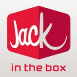
Jack In The Box Brand Redesign Makes Juvenile Humor Much Easier
By 3.10.09
I’ve always thought “Jack in the Box” was a weird name for a fast food restaurant, but this new branding approach the company is rolling out in San Diego—where Jack HQ is located—seems like a step back. By isolating “Jack,” so much, they’re going to be sending immature people everywhere into fits of smirking. I keep imagining commercials with taglines like: “It’s time for a little Jack,” or “Hungry? Jack it!” Other than that, is it just me or does it look incredibly retro?