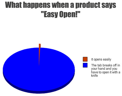
Maybe it’s really a cross-promotional plot between them and BAND-AID. [More]
graphs
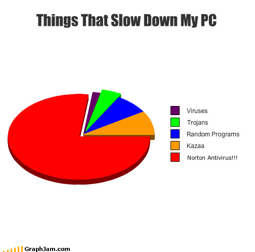
Norton Has Detected Itself
A non-scientific pie chart showing which things one man perceives as slowing down his PC, in order from least to most lethargy-inducing. [More]
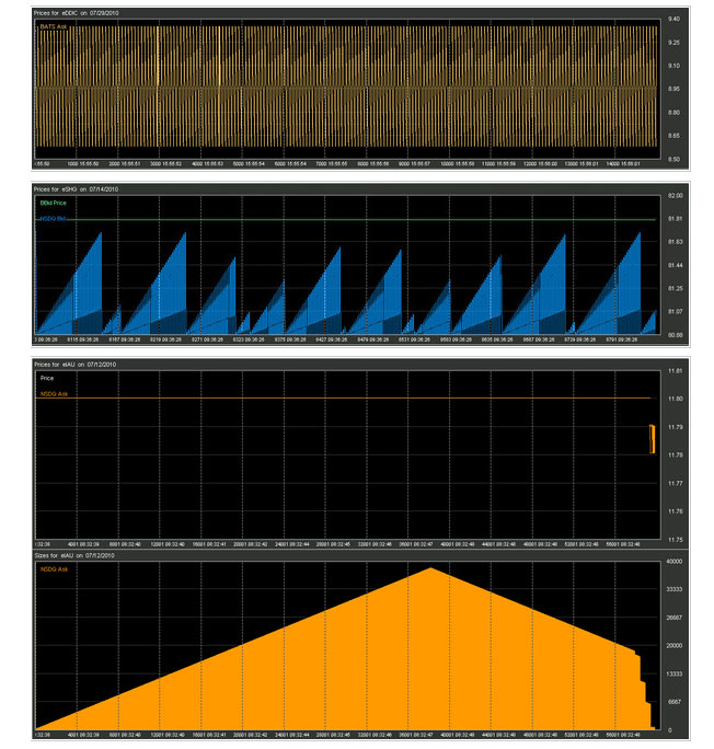
Robot Traders Leaving Behind Bizarre "Crop Circles" In Market Data
Following the May 6 “flash crash” in which the market plunged 1,000 points in just a few minutes, a data firm started looking at the trades being made by the high-frequency computerized trading bots that have come to loom over over the stock market. By zooming into the trades being placed by the millisecond the firm spotted several strange algorithmic patterns. Plotted on a chart, they look like the freakin’ the stock market equivalent of crop circles. [More]
What Bills Are In Circulation The Most?
Visual Economics has a fun chart that shows how many of each denomination of U.S. currency is in circulation, as well as their average lifespans. For some reason, the $5 bill has the shortest lifespan. Also, seriously, we need to stop producing pennies NOW.
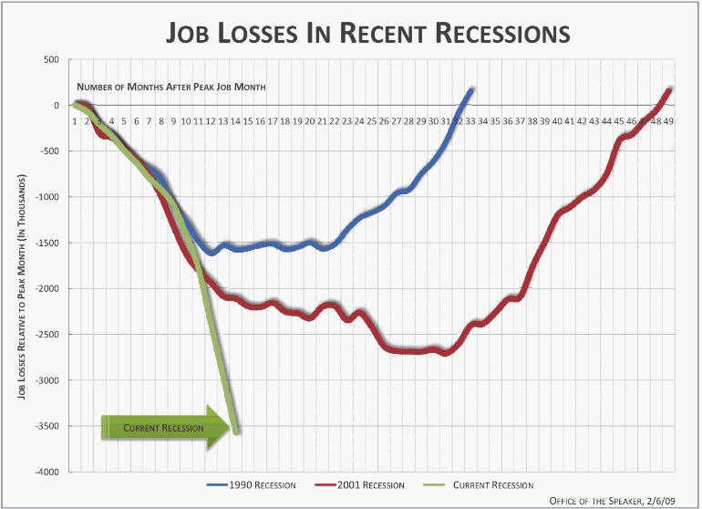
Just How Bad Is This Recession? Look At The Scary, Scary Graph
Nancy Pelosi wants to scare the crap out of you, so her office has released the above scary graph, which we bring to you by way of Time’s Swampland blog.
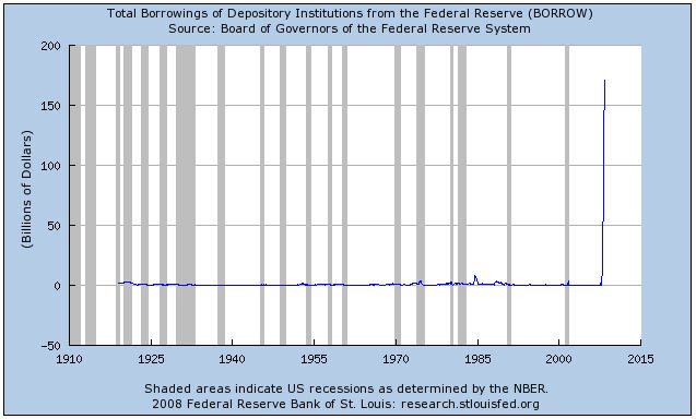
So, How Much Money Are Banks Borrowing Thanks To The Mortgage Meltdown?
Here’s a graph from the Federal Reserve Bank of St. Louis that shows, historically, how much money banks have borrowed from the Federal Reserve.
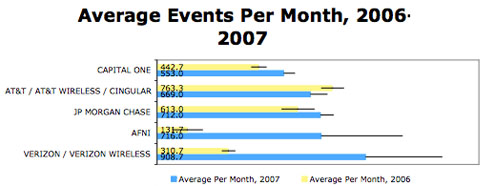
Verizon Was The Most Frequent Target For Identity Theft Scams In 2007
Identity theft reports to the Federal Trade Commission show that Verizon was the most frequently named company, averaging over 900 events per month in 2007. According to an updated study by Chris Hoofnagle, senior fellow at the Berkeley Center for Law and Technology, the number of complaints involving Verizon nearly tripled from 2006. Rounding out the top five are AFNI (a collection agency), JP Morgan Chase, AT&T, and Capital One.

Pretty Graphs Track Drowning Dollar
These graphs by GOOD magazine show how much the dollar has sunk against various currencies from May 07-April 08. But don’t feel too bad, folks, at least we’re giving the South African Rand a thorough drubbing.
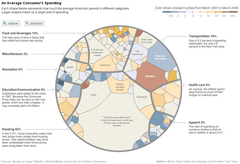
Visualizing Inflation As A Pile Of Mold
The NYT has a cool graphic up that shows all the parts of the Consumer Price Index and uses a color scheme to show how much they’ve gone up by in the past year. Go to the version on their site so you can zoom in closer on all the cells. It looks like a horribly growing fungus inside a petri dish, which I guess is not far from the truth.

Consumer Price Index Shows That Consumers Like Eating Out, Gasoline
The New York Times made a pretty cool graph out of the Consumer Price Index, which tracks changes in prices for many consumer goods over the past year. Turns out, gas prices went up.
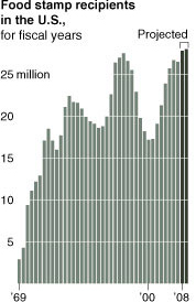
../..//2008/03/31/with-consumers-pounded-by-dissapearing/
With consumers pounded by dissapearing jobs, and rising gas and food prices, food stamp use is projected to reach record levels in 2008 and 2009. [NYT]

Estimated Hourly Wages For The Lowest Paying Jobs In The U.S.
The blog Political Calculations took data from the Congressional Budget Office, “which published a study of the lowest-wage workers in the U.S. from 1979 through 2005,” and looked at the occupations of the bottom 20% of earners in the U.S. Then it took a chart of the 10 full-time jobs with the lowest annual earnings as compiled by BizJournals.com and estimated the hourly wage based on 40-hour weeks. Conclusion: don’t plan on operating a Tilt-a-Whirl and retiring comfortably.
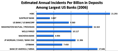
HSBC Is The Most Identity-Theft Prone Bank
If you’re a customer with Bank of America or HSBC, you’re more likely to be a victim of identity theft, according to a new report. Chris Hoofnagle, a senior fellow at the Berkeley Center for Law and Technology at the University of California at Berkeley, compiled a list of all the banks mentioned in identity theft complaints filed with the FTC for January, March and September of 2006. Bigger banks obviously have more incidents, so Hoofnagle factored in their total number of deposits.”I’ve been working for years to try to spark a market, a true market, for competition on preventing fraud,” Hoofnagle told the NYT. “Some of these institutions have attempted to compete based on advertisements, but I’m a real believer in the idea that if you give consumers information, they can make better decisions.” This is only a fraction of the banks included, showing the worst offenders. Full graphs, inside…
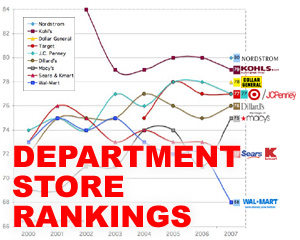
Latest ACSI Survey Is Out: You Really Like Dollar General
The American Customer Satisfaction Index has released its latest scores of retail businesses, so we thought we’d take a look at the department store rankings by constructing a handy graph. When it comes to customer satisfaction, apparently Dollar General is doing something right—and Wal-Mart, as usual, is doing lots of things wrong.
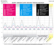
How You Spend Your Money
Our brain nearly broke looking at this graph the New York Times published this weekend called How Americans Spend Their Money (click to enlarge). By the looks of it, poor people spend twice as much as they earn in taxable income. Rich people outspend the middle fifth on financial stuff by a factor of ~20:1. What the middle fifth and the lowest fifth spend on goods and services is closer than what the middle fifth and the highest fifth spend. The lowest fifth financial flows are very much in the negative. And that’s about all the staring at a crazy graph we can do for the moment. What other trends can you see?
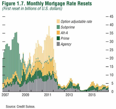
Monthly Mortgage Rate Resets, 2007-2016
Credit Slips’ Adam Levitin takes a look into the possibly even grimmer future of the housing market. We’ll let him explain it because he’s smart:
…this graph from Credit Suisse is the most sobering thing I’ve seen in a while. Mortgage_rate_resets It shows that most of the interest rate resets ahead aren’t subprime, but are instead Alt-A and option-ARMs…
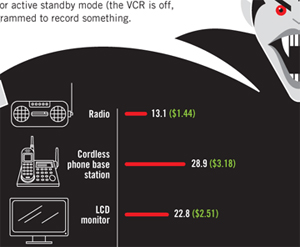
Vampire Electronics Suck Power Even While "Off"
As long as they’re still plugged in, most appliances are still sucking energy out of the wall, and dollars out your wallet. GOOD magazine made another one of their pretty graphs, this time featuring a large vampire, to show how much energy and money devices continue to leech. Some people, to combat this vampiric gadget effect, have most of their devices hooked up on powerstrips so they can fully cut power to all non-essential items with just a flick of a few switches.
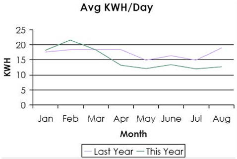
Installing CFLs Decreased Family's Electric Bill
Blogging Away Debt made this graph to show how much their family reduced energy consumption by installing compact fluorescent light bulbs and unplugging a freezer in the basement. The chart shows a decrease of around 2-3 average kilowatts hours per day, resulting in electrical bills that were about a half as much as before.


