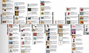
Processed vegetables up, eating out at Applebee’s down. [More]
charts

How To Always Get An Exit Row Seat
Exit rows are magical areas on airplanes where you’ll aways have that most rare and precious commodity known as “legroom.” On some airlines you’ll have to pay extra for the privilege. On others, it’s yours just for asking. Airfarewatchdog breaks down the exit row policies by airline so you can pick the flight that makes it easiest or know what you have to do to get that extra stretch space for your feet. [More]
Super Complex Chart Of How A Mortgage Gets Securitized
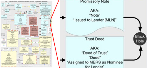
Gee, how could people who haven’t graduated high school mess this up? This is a chart showing how a mortgage gets securitized made by a guy whose job is to audit securitizations by reverse-engineering them. This is one he did for the mortgage on his own house. My favorite part of the diagram is where the documents go into a black hole. Literally, that’s an actual part of this flowchart. [More]
The Real Underemployment Figure Is 22.5%
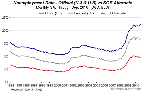
Ever get the feeling that things are a lot worse than everyone is letting on? [More]
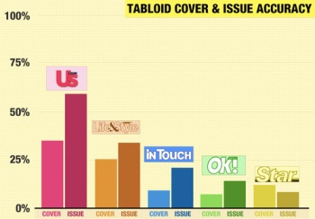
Which Tabloids Give You The Most Lies For Your Buck?
Whether you like it or not, the five major glossy tabloids — Us Weekly, InTouch, Life & Style, Star and OK! — are still among the highest-selling periodicals, in spite of the fact that many readers know much of what’s printed between those magazines’ covers is stretching the truth, if not outright fiction. But the next time you’re stuck at the airport newsstand and you can’t decide which “Baby Time For Jen Aniston” cover to buy, there is now some guidance. [More]

How Do Airlines Compare On Fees?
It’s hard to keep track of all the extra fees airlines have invented to pad a ticket purchase, especially since they keep introducing new ones; USA TODAY says revenue from added fees have jumped nearly 16% from a year ago. The newspaper reviewed fees from 13 airlines in the U.S. and compiled this handy reference chart of current fee schedules, to make comparison shopping a little bit easier. As expected, Southwest continues to be one of the best values. [More]
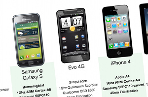
Use This Chart To Pick The Best Smartphone
Lifehacker reader Apollo Clark has put together a matrix that compares seven of the most popular and/or feature-packed smartphones on the market, as well as the iPad for some reason. If you’re planning on trading up to a fancy new phone/multimedia device in the next couple of months, it’s worth checking out to see which phones best align with your wish list. [More]
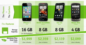
Billshrink: iPhone 4 Is Best Value Among Latest Smartphones, If You Watch Data Usage
BillShrink compared the new iPhone 4 to the Droid Incredible, the Evo 4G, and the Nexus One to see which one is the cheapest in total cost of ownership, and the results were somewhat surprising given the iPhone’s reputation as a money gobbler. If you opt for the cheapest data plan AT&T offers, the TCO for the iPhone 4 is the only one of the four devices that comes in under the $2,000 mark. But beware! That “cheapest data plan” conditional is a pretty tricky one. [More]
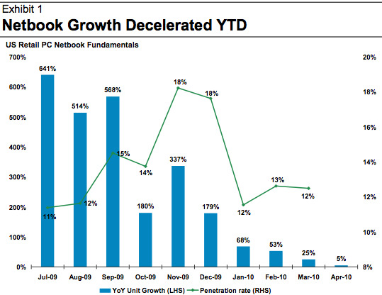
No, The iPad Hasn't Killed The Netbook
Netbook sales growth has slowed down! Apple has sold a million iPads! Quick, someone make a chart and prove that there’s a causal relationship between the two facts.
That’s essentially what Morgan Stanley did this week, and many media outlets picked it up as gospel. But there’s no real evidence that the iPad has had any significant effect on netbook demand.
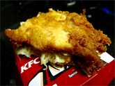
Science: Is The KFC Double Down The Worstest Food Ever?
Speaking of the health value of KFC Double Downs (KDD), some smart fellow has created two charts which compare the nutritional content of the KDD to roughly two dozen other fast food items. Assigning the KFC Original Recipe Double Down (KODD) a base score of “1.0,” the charts show how many KODDs are contained within other sandwiches as a portion of the USDA daily allowance, based on how much fat, sodium, and cholesterol are inside them. The chart may not sway your opinion of the zesty saltlick “sandwich” that is taking America by storm, but its colors may remind you of fries, pickles, and ketchup. Mmmmm, is it second lunch time yet? [More]
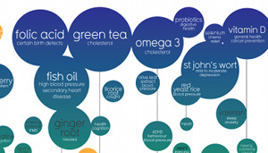
Interactive Chart Helps You Vet Health Supplements
Are you tired of forgetting whether you should add creatine or cinnamon to your kale smoothie? Do you worry that the milk thistle you’ve rubbed on your genitals isn’t helping? The “Snake Oil?” graphic at informationisbeautiful.net can help you out–it provides a graphical overview of 166 different health supplements and arranges them according to how much evidence there is that they actually work. [More]

Chart Makes Comparing Cell Phone Carriers Slightly Less Confusing
If you’re in the market for a new cell phone and calling plan, the sheer number of options is terrifying. According to Billshrink.com, there are (theoretically) 10,000 possible combinations of voice plans, data plans, other add-ons, and … I think I need to lie down. But wait! Here’s a nice, objective cell phone plan comparison chart that can help you make sense of all this madness! [More]

A Chart Of The Myriad Airline Baggage Fees
DansDeals put together this massive chart of baggage fees from 21 American and Canadian airlines. [More]
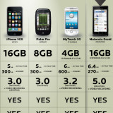
Chart Compares Total Cost Of Ownership For Popular Smartphones
You may think that buying an iPhone with AT&T service is an expensive commitment, and you’d be right. But as this chart from BillShrink shows, your total cost of ownership (TCO) for any of the latest smartphones is going to exceed 2 grand over a 24-month period. In fact, the highly-praised new Motorola Droid on Verizon works out to exactly the same TCO as the latest iPhone.
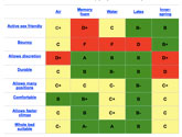
Mag Says T-Mobile Is The Best At Cell Phone Customer Service
Laptop Mag pitted AT&T, T-Mobile, Sprint and Verizon in a battle royale to decide who was the fairest of them all in regards to customer service. The magazine’s investigation found T-Mobile led in all three ways to contact the companies — the physical store, online and over the phone — and took the overall crown.
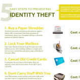
5 Ways To Prevent Identity Theft
If you’re still not shredding, locking, and canceling, maybe a giant graphic will get the point across. Follow these five tips and you’ll be well on your way to securing your side of things when it comes to ID theft.


