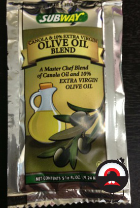
Fun With Fonts: How Subway Tries To Distract You From Realizing How Little Olive Oil Is In This Packet Image courtesy of Thanks to Ed for the tip!
There’s the obvious size differential, with the most prominent words on the packet being “OLIVE OIL” in large type in the center of the arced ribbon. Below these words, in significantly smaller but still noticeable type, is “BLEND,” which may cause some to wonder what the rest of the stuff is.
But it’s in the tiny type squeezed above “OLIVE OIL” that you get the truth with “CANOLA & 10% EXTRA VIRGIN.”
The real master stroke is in the text that fills the appropriately olive-green background, located above the image of olives and to the right of the drawing of the corked container that presumably contains olive oil.
In tightly kerned italics, it reads “A Master Chef Blend of Canola Oil and 10%” before suddenly bursting into larger, all caps, “EXTRA VIRGIN OLIVE OIL.”
See, not only is this information, which Subway doesn’t want you to read, set in a harder-to-read font, it’s also prefaced with the words “A Master Chef Blend,” the kind of stupid marketing language that most of us tune out as soon as we see it. Subway is hoping you don’t continue past those words and just skip right to “EXTRA VIRGIN OLIVE OIL.”
We’re not saying that what’s going on here is wrong or insidious. After all, the information is all provided to the consumer. But it helps to occasionally point out the ways companies play with design to trick your eyes into seeing what the company wants you to.
Want more consumer news? Visit our parent organization, Consumer Reports, for the latest on scams, recalls, and other consumer issues.


