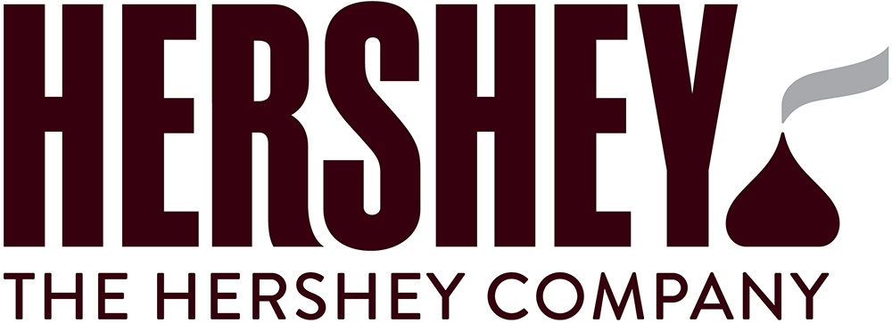
Hershey Joins Elite Club Of Companies With Poo-Like Logos
 Hershey decision to redesign the company logo to look more chocolaty was probably well-intentioned. But as they say, the road to hell is paved with good intentions… and littered with poo from jerks who don’t pick up after their dogs.
The response to the designers’ use of an unwrapped Hershey Kiss — complete with a wafting paper ribbon — has been met with some less than kind reviews from the readers of UnderConsideration.com, where variations of the poetic phrase “steaming pile of turd” are repeated.
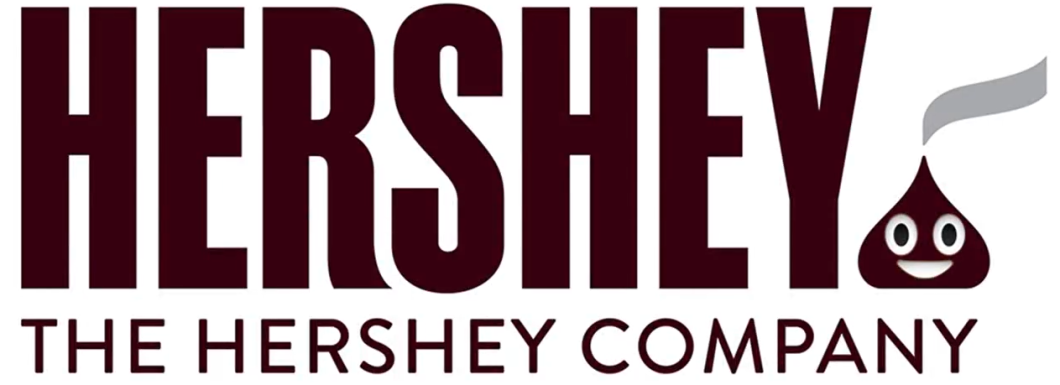
And as FastCoDesign’s Mark Wilson points out, the logo is just some blinking eyes away from being a poo emoji:

The good news is that Hershey is in good company, joining Santander as one of the few companies with logos that literally look like crap.
Want more consumer news? Visit our parent organization, Consumer Reports, for the latest on scams, recalls, and other consumer issues.


