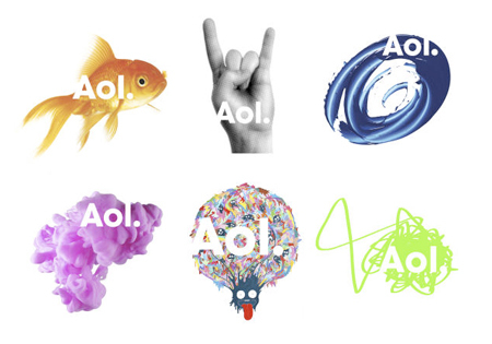
AOL Rearranges Deck Chairs, Introduces New Logo
Close to severing ties with Time Warner and fresh off announcing that they plan to cull almost a third of their work force by the end of the year, AOL has debuted–why not?–a new logo and branding campaign. The new logo has a variety of backgrounds, but always the new name in a sans-serif font: “Aol.” Yes, with the period.
The question is, does the world even need AOL–er, “Aol.”–anymore?
“AOL had such a clear meaning in the early days of the Internet,” said Allen P. Adamson, managing director of the New York office of Landor Associates, a brand and corporate identity consultancy that is part of the Young & Rubicam Brands unit of WPP.
“To re-establish AOL as relevant today requires a massive shift in what it stands for to be effective,” Mr. Adamson said. “Being around a long time in technology is already one strike against you.”
Although to many, AOL “signals your father’s Internet,” he added, the new brand identity retains the name.
AOL Revamps Its Logo, Hoping to Revive Brand [NY Times]
Aol. Generation. Next. [Brand New] (Thanks, Graham!)
Want more consumer news? Visit our parent organization, Consumer Reports, for the latest on scams, recalls, and other consumer issues.


