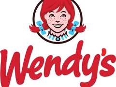
Wendy’s Gives Its Girl A Makeover In Attempt To Update The Chain’s Image
Hey, girl — did you do something different to your hair? More pipe cleaners in your pigtails, perhaps? The Wendy’s girl is getting an a new look for the first time since 1983 in an effort to draw more customers through the restaurant chain’s doors. Gone is the old-fashioned lettering, and in its place a red swoopy “hey, we’re totally chill!” font bears the Wendy’s name.
The Associated Press talked to Wendy’s CEO Emil Brolick, who spoke highly of the current logo but said that it was time for a change. Of course, with change comes complaints from faithful customers, so the new logo was tested out thoroughly before it was rolled out.
“When we pushed things too far, they very much reeled us back,” he said of consumer feedback.
The logo makeover will be in evidence at new and renovated locations starting in March 2013, and is just one part of Brolick’s push to revamp the Wendy’s image. He’s also worked to update restaurants with inviting changes like natural lighting, flat-screen TVs and comfier seating. The idea is, customers might feel more like they want to come in and stay awhile.
“Our goal is to be a five-star restaurant at a three-star price,” said Brolick of the changes.
For those who didn’t know, the Wendy’s name and image were based on founder Dave Thomas’ daughter Melinda Lou, who went by Wendy. At the opening of his first restaurant, Wendy wore a blue-and-white striped dress and her parents stuck pipe cleaners in her hair to make her pigtails stand out.
Wendy’s gives its icon a makeover [Associated Press]
Want more consumer news? Visit our parent organization, Consumer Reports, for the latest on scams, recalls, and other consumer issues.


