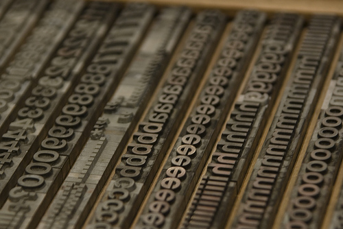
helvetica

New Gap Logo: Next Tropicana-Style Redesign Flop?

New Gap Logo: Next Tropicana-Style Redesign Flop?

The marketing geniuses at The Gap seem to have fiddled around with Photoshop for a few minutes and designed a new company logo that’s as bland and uninteresting as jeans and a black t-shirt. It’s not ugly, but it’s not memorable or creative, either. What were they thinking? [More]

The Font Of The 20th Century

The Font Of The 20th Century

The miscellany gods at Slate have compiled a slideshow describing how companies such as American Airlines, Sears, Target, ConEd, Verizon, and the New York Subway system use the font Helvetica to convey a sense of “modern efficiency with a human face.”

Ultimately, Helvetica is a cipher–and this is the key to its success. It can be authoritative or ironic, sober or idealistic, corporate or cozy. It’s the tofu of typefaces: bland in itself but ready to absorb whatever flavors you add to it. It’s clean, legible, and well-designed, but its real power lies in its uncanny mutability.

Though we seldom think of many of the companies using Helvetica as efficient, it’s nice to know what they were striving for when they chose their font. — CAREY GREENBERG-BERGER