Where Did The Target Prescription Bottles Everyone Loves So Much Come From, Anyway? Image courtesy of bartsz
We didn’t realize how much affection consumers had for Target’s ClearRX prescription bottling system until the bottles went away after CVS purchased Target’s pharmacies. Maybe customers themselves didn’t realize how attached they were to those bottles until they were consigned to memory, but with the CVS takeover of Target’s pharmacy business, they’re now gone. Why are people so attached to a prescription bottle, though?
The bottles were the chief complaint that customers had about the changes that came in with CVS: even customers with more serious complaints that could affect their health still mentioned the bottles.
What’s so special about them and why did only Target have them? We thought we’d take a look at the origin of this bottling system, and what people liked so much about it.
The Flaws of Amber Bottles
Image courtesy of Mark RoundThe legend of ClearRX began with a student at the School of Visual Arts in New York. The tiny, confusing print on standard prescription bottles led to inspiration, and the student, Deborah Adler, began her ambitious senior thesis project. The idea came from something that happened to her grandparents: Her grandmother took her grandfather’s medication by mistake. She wanted to re-design the prescription bottle from the ground up.
Standard prescription bottles emphasize the wrong things: the pharmacy’s name is in big type, while the instructions and even the patient’s name are in tiny type. The detailed information about side effects that can contain useful information is stapled to the outside of the bag, and probably won’t stay with the bottle.
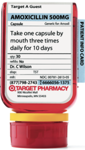
On the ClearRX bottle, the information that patients actually need is prioritized.
“People want to know the name of the drug first, then how they should take it. But it’s never presented that way,” Adler told New York magazine before the debut of her bottles at Target in 2005.
The name of the drug is across the top of the bottle and in large type at the top of the label. Below that are the directions, also in larger type with white space around them to emphasize them.
The label is on a flat surface of the bottle, not a rounded one, making it easier to read, and warnings are listed on the back, not on stickers that could be placed sideways or be in colors like orange or red that blend in with the amber-colored bottle.
Finalizing the Design at Target
Image courtesy of MollyAfter the project was complete, she brought it to the FDA, but Target bought the designs instead. The retailer hired an industrial designer to adapt the idealistic student’s design for the real-life constraints of the pharmacy: for example, the different-colored labels for medications taken at different times of day weren’t practical, but the rest of the design was. The industrial designer was the one who turned the bottles upside down.
 The final design was a rounded triangle that stands up on its cap. All pill bottles have the same size cap regardless of their size, saving money, and the neck of the bottle has a plastic ring around it with a different color indicating which family member’s medicine it is. (They would even insist on assigning you a color if you told them that you live alone, I discovered.)
Labels fit over the top of the triangle, and their sheet prints out on a standard-sized piece of paper. The information sheet is folded up and fits behind the label, so it’s always with the bottle.
For liquid medications, the stores gave out oral syringes to help with accurate doses, and offered a variety of flavors in liquid medications, too.
People tend to take more medications as we age, but standard childproof caps are unfriendly to arthritic hands, and there’s still all of that tiny text.
Target was its exclusive user until the deal selling its pharmacy business went through this year. Now CVS owns the system, meaning that the nation’s largest drugstore chain could make drug-taking much safer across the country. Will it?
The Perfect Prescription [New York]
Clear Rx Medication System [Deborah Adler Design]
Want more consumer news? Visit our parent organization, Consumer Reports, for the latest on scams, recalls, and other consumer issues.


