See How Ratings For Episodes Of Your Favorite TV Shows Stack Up In Graph Form

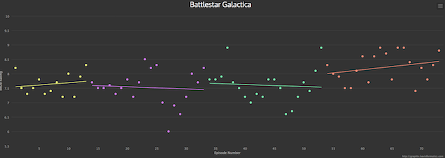
So many pretty colors. (GraphTV)
There’s a really cool interactive created by Kevin Wu called GraphTV (via FlowingData.com) that lets you plug in any show, then calls up a graph that plots the show’s ratings per episode, over time and by season, using IMDB information.
WU explains the project thusly:
Graph TV is a visualization tool which graphs tv show ratings by episode. Each season is assigned a different color and linear regressions are calculated for each season as well as for the entire series. Each point on the graph displays the episode title, rating, and other data. The data points are clickable and will open its IMDb entry. The graphs are also exportable for offline use.
It’s the perfect tool for anyone who wants to retrace the steps of a once-beloved show that ends up falling down a flight of stairs and smacking its head, resulting in a long, drawn out death. But in graph form, so that makes its demise that much easier to take, right? That’s what I’ll tell myself
Want more consumer news? Visit our parent organization, Consumer Reports, for the latest on scams, recalls, and other consumer issues.

