Here Are Two Charts To End Your Day With A Frown (Even If You’re Exceedingly Wealthy)
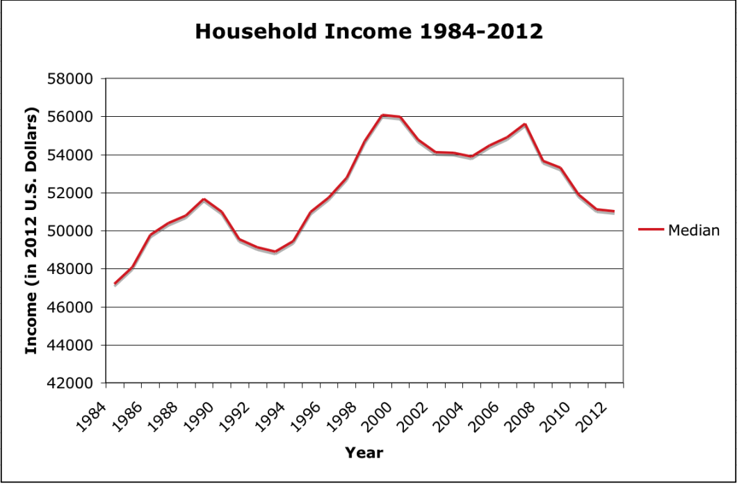
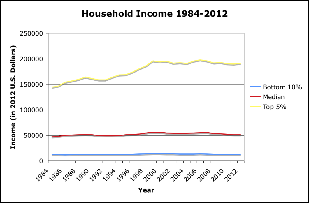
According to data released by the U.S. Census Bureau, the median household income in 2012 was $51,107, down for the fifth year in a row since hitting $55,627 (adjusted for inflation) in 2007, and several hundred dollars below the $51,681 (in 2012 dollars) earned by the median household in 1989.
On a silver-lining kind of note, we’re still above the early ’90s recession trough of $48,884. So we’ve got that going for us…
Meanwhile, the highest-earning 5% of households (see below) had average income of $191,156 in 2012, a sizable improvement over the inflation-adjusted 1989 number of $164,041. But even these most well-heeled Americans are still reeling from the economic crash, as this figure has hovered around the $190,000 mark since falling off its 2006 peak of $198,166. For an income group that saw its average inflation-adjusted income soar by 35% from $144,000 to to $195,000 during the same time period as median household income only netted a 15% increase, no growth might is like being poor.
And then there is the most depressing line on the graph — income from the lowest 10% household income group. With an average income of $12,236 in 2012, these households were faring better as far back as 1988 when they averaged $12,242. Even the 1984 inflation-adjusted number of $11,991 is only 2% less than the current average income level of this group.
Want more consumer news? Visit our parent organization, Consumer Reports, for the latest on scams, recalls, and other consumer issues.


