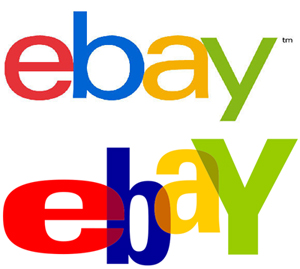
Listen, everyone: you might think that eBay’s new logo is pretty much the same as its old one, but really it’s totally different and is definitely going to launch the company over its competitors. At least, that’s the thinking behind the update, which keeps eBay’s signature colors but lines up all the letters in a straight line instead of the previous jumbliness it had going on. [More]


