You know what’s even worse than using the font Comic Sans for every message you create on a computer, printed and online alike? Bringing the horror to the real world by using these two-inch-tall Comic Sans stencils. Don’t do it. Not even you, Banksy. [More]
fonts
Save Money By Switching To Century Gothic
By 5.5.10
Century Gothic, a knockoff of classic sans serif fonts like Twentieth Century and Futura is one of the more stylish typefaces bundled with most Windows computers. And it turns out it’s also one of the cheapest to use. A study by Printer.com found that using Century Gothic instead of fonts like Tahoma or Franklin Gothic can cut toner costs by as much as 31%. [More]

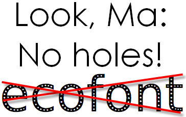
Save Ink Or Toner By Changing Your Font
By 10.8.09
Sure, you can save ink and paper by changing around your printer settings, but to truly commit to saving ink or toner, try changing your font.
By 2.7.09
../..//2009/02/07/fun-weekend-project-make-your/
Fun weekend project: make your own homemade font for free. [CoolTools]
The Font Of The 20th Century
By 5.27.07
The miscellany gods at Slate have compiled a slideshow describing how companies such as American Airlines, Sears, Target, ConEd, Verizon, and the New York Subway system use the font Helvetica to convey a sense of “modern efficiency with a human face.”
Ultimately, Helvetica is a cipher–and this is the key to its success. It can be authoritative or ironic, sober or idealistic, corporate or cozy. It’s the tofu of typefaces: bland in itself but ready to absorb whatever flavors you add to it. It’s clean, legible, and well-designed, but its real power lies in its uncanny mutability.
Though we seldom think of many of the companies using Helvetica as efficient, it’s nice to know what they were striving for when they chose their font. — CAREY GREENBERG-BERGER