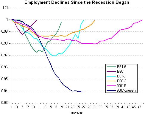
This graph shows employment declines at the same chronological point during America’s last six recessions. Guess which one represents the current recession. Go ahead, guess. [New York Times] (Thanks, Dan!) [More]
This graph shows employment declines at the same chronological point during America’s last six recessions. Guess which one represents the current recession. Go ahead, guess. [New York Times] (Thanks, Dan!) [More]
![]()
Part of ![]()