Why Is Verizon Misleading Consumers With The Charts In These FiOS Ads?
If you live near one of the few areas in the country in which Verizon actually operates its FiOS network, you might have seen one of the ads where a Verizon FiOS shill asks “America” to look at a charts claiming to show customer satisfaction results for the nation’s largest Internet and pay-TV providers. Looking at those chart, it appears that Verizon is blowing the competition smithereens. The reality is not as dramatic, graphically speaking.
Check out the above ad in which the chart compares pay-TV providers using data from the American Customer Satisfaction Index. Here’s a screen grab of the chart so you can see it more closely:
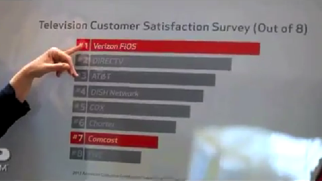
Wow… FiOS is really far out in front! Customers must frickin’ love these guys, right?
This sentiment is even more obvious in this screengrab from the Internet customer satisfaction version of the ad, which shows Verizon crushing the field:
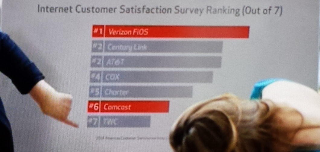
And since these ads are specifically targeted at bottom-dwelling Comcast and Time Warner Cable, we collapsed the charts to see just how much better Verizon is that these merger buddies.
Here’s the TV one, showing that Verizon’s customer service rating is apparently better than twice that of either Comcast or TWC:

And the story looks to be the same over on the Internet customer satisfaction survey:

But there are numerous problems with the data that Verizon presents in these ads…
1. SELECTIVE TIMING
When we looked at the fine print for these two ads, we noticed that the Internet one is using ACSI data from 2014, but the pay-TV ratings are from 2013… Why could that be?
That’s because FiOS is no longer the top-ranked pay-TV provider by ACSI respondents. In fact, according to the 2014 data for this industry, FiOS has dropped to third behind AT&T and DirecTV.
Here’s what the real graph for the most recent ratings would look like:
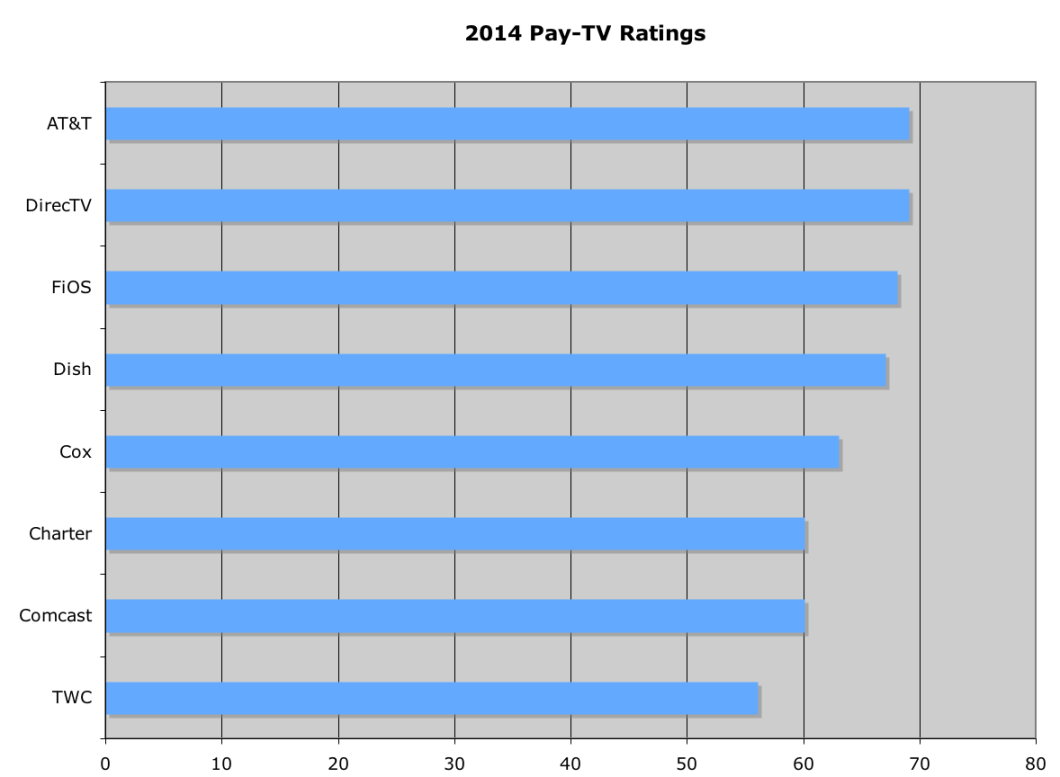
But something else is strange about this chart, other than the fact that Verizon is now barely eking out a bronze medal in front of Dish. It seems like the gap between the industry leaders and the worst of the bunch is nowhere near what the Verizon ad made it out to be.
Because here is a case of…
2. ZOOMING IN
You know how it’s sometimes hard to see differences between a group of similar objects when you’re looking at them from far away? But then you move closer and the differences become more apparent.
It looks like Verizon decided to do this with the ACSI charts in order to give viewers a false impression of its dominance in the customer satisfaction rankings.
As we showed above, the charts in both ads tell a story that Verizon is at least twice as satisfying to customers than either Comcast or TWC. But, monkeying around with the chart, it looks like Verizon zoomed in to only cover a segment of the data — without revealing that the chart doesn’t start at 0, but more likely around 50.
Here’s our approximation of Verizon’s zoom-in job:
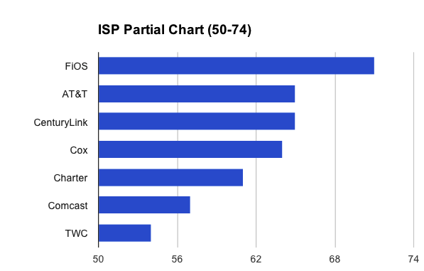
By zooming in, Verizon maximizes the visible differences between the scores, glossing over the reality that the rankings are much more clustered than the chart in the ad implies.
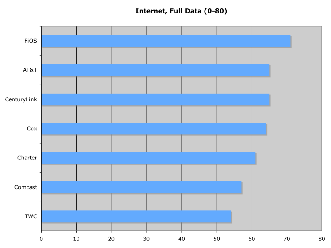
Here’s the much less marketable, but more accurate, chart that should have been in the Verizon ad:
3. Show Me The Numbers
One thing you’ll also notice about the charts in the Verizon ads is that they lack any sort of numbering — other than the rankings.
Not only does this allow Verizon to give TV viewers the impression that Comcast and TWC’s scores are much worse than they are, it also lets Big V hide the fact that its numbers aren’t so impressive.
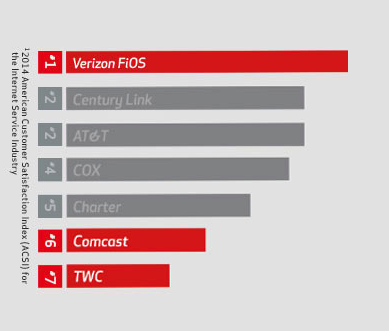
This chart, a copy of the one of the TV ads, is on the FiOS marketing site without any explanation of the data manipulation involved.
Making matters worse, the company continues the lie over on this website that it touts during the TV ads.
But like a child who makes up a lie because they think the truth will get them in trouble, the fact is that…
Verizon Didn’t Need To Do This
Here’s what makes all these attempts at visual deception and exaggeration so unnerving: Verizon didn’t need to do mess with these charts.
The company is indeed far ahead of the rest of the industry on the ACSI Internet rankings; it’s the only one of the ISPs on the list to score above a 70, and it’s done so for two years in a row. While that’s not a blazing-hot number, it is about the best you’re likely to ever see from an ISP.
And Comcast and Time Warner Cable do indeed stink like a scared skunk. Their scores are among the worst of all companies ranked by ACSI — not just the cable and ISP industries — and are so far in the rear that the difference between the bottom and top scores is apparent without zooming in.
Want more consumer news? Visit our parent organization, Consumer Reports, for the latest on scams, recalls, and other consumer issues.

