What If Food Labels Looked Like This?
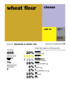
Maybe the real reason Americans are so fat is because our food labels are so ugly. If they were easier on the eye to read, maybe more people would read them and make better eating choices. That was the idea in mind behind a recent design contest at the University of California, Berkeley, School of Journalism aiming to give the standard government-mandated food label a much-needed makeover. The winning entry uses colored boxes for each ingredient that are sized in proportion to how much of each is inside the package.
The entry submitted by designer Renee Walker is a big improvement in terms of readability. The simple graphical approach makes it easier to understand what’s inside. The question is whether it would be able to deal with products that have a more complicated series of ingredients. You can look through the juried selections yourself and vote for the best one by sharing it on Facebook. The winners will be forwarded onto the FDA for consideration.
Rethink the food label [News21]
Designing a Better Food Label [NYT]
Want more consumer news? Visit our parent organization, Consumer Reports, for the latest on scams, recalls, and other consumer issues.