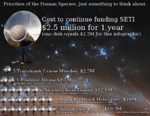
On the back of news that SETI, an array of satellite dishes that search for extraterrestrial intelligence, would be shut down, John at μcosmologist put together a infographic to compare the cost of running it against other things. For instance, it costs $2.5 million a year to run one SETI satellite, while one Predator drone costs $4.5 million. A Citibank exec’s bonus? $19.3 million. And if just a small part of the $10.7 billion Starbucks made last year was put aside instead of paying for their employee’s health insurance, we’d have ET’s whole city in the bag. In comparison, continuing to send and seek out bleeps into a silent and uncaring void isn’t that much. Check out the full version here, and stick around for the money shot by scrolling all the way to the bottom. [More]
infographics
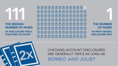
Checking Account Disclosure Documents Are Longer Than Romeo & Juliet, Contain Less Teen Sex
We recently wrote about the PIRG study showing how fewer than 40% of banks were willing to clearly disclose checking account fee schedules. Now a new report from the Pew Charitable Trust demonstrates just how far banks are willing to go to make it difficult for consumers to know what they are getting with their checking accounts. [More]
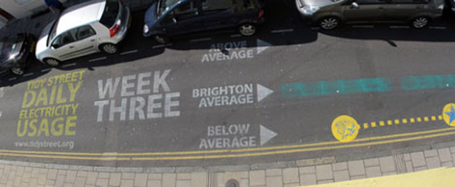
Block Cuts Electricity Use By 15% By Chalking Meter Readings On Street
Residents of one block in Brighton in the UK are tracking their electricity usage via a giant infographic graffitied onto the street. In the three weeks the project has been running, electricity use has dropped 15%. Amazing the great good a little bit of feedback can do! In America people would probably just compete to see how big they could make the electricity drain go. [More]
Learn All About For-Profit Education: For Free
We often post here about the problems with for-profit higher education: high-pressure recruitment, unrealistic job placement expectations, and huge debt loads. If you know anyone considering enrolling at a for-profit school, this infographic from Campus Progress synthesizes quotes from people involved in the industry, statistics, and facts in an easy-to-digest cartoon form. [More]
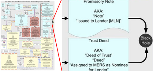
Super Complex Chart Of How A Mortgage Gets Securitized
Gee, how could people who haven’t graduated high school mess this up? This is a chart showing how a mortgage gets securitized made by a guy whose job is to audit securitizations by reverse-engineering them. This is one he did for the mortgage on his own house. My favorite part of the diagram is where the documents go into a black hole. Literally, that’s an actual part of this flowchart. [More]
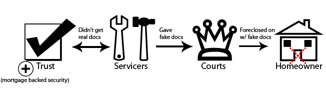
How The Current Foreclosure Fraud Crisis Works
A simplified way to understand how the current foreclosure fraud crisis got started. It all became unwound when a foreclosure mill “robo signer” admitted in a deposition to signing more than 10,000 affidavits in one day, little lies on slips of paper that got people thrown out of their houses. [More]
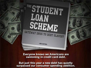
Student Loans, Gateway Drug To Debt Slavery
One of the most important lessons students learn in college is how to get into debt and stay there. It’s crucial to the success of the Republic. An indebted population is easier to control; needing to pay off crushing debt – a debt that if defaulted on has been stripped of many normal consumer protections and rights – graduates more willingly shuttle into cubicles, becoming the square pegs demanded by the square holes. After a few futile years of floundering idealism, their souls have been successfully jackbooted into powder and they’re ready to keep the thumb on the next generation of would-be drones so as to protect their empire of matchsticks. But how did we get here? This chunky infographic examines the origins and (d)evolution of the student loan leviathan. [More]
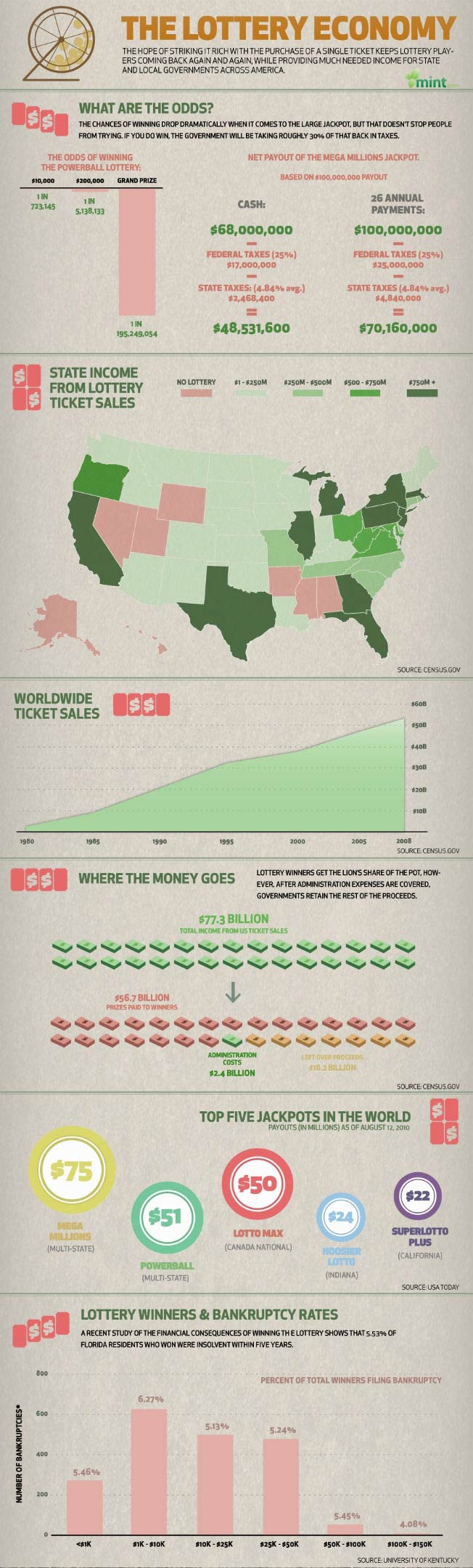
You're More Likely To Go Bankrupt From Winning A Lottery Than To Win One
The tiny chances of winning a lottery don’t stop people from playing. And even if you do win, there’s a chance you’ll only get 50% of the advertised winnings, after taxes. The house always wins. This big ol infographic breaks down the numbers for you: [More]

Why Paying More For Brand Name Drugs Is Folly
There are some people out there who just don’t get how much crazy money you can save with buying generic drugs. For those folks, this infographic was crafted by Mint.com. To illustrate the cost-savings possible, they took a look at Advil. For the same 200 mg of isobutylpropanoicphenolic acid, people are willing to pay over $8 more per box. Those pretty graphics aren’t going to chase away your headache any faster, honey. Let’s take a look: [More]
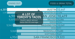
Does Your City Spend A Lot On Eating?
When it comes to spending on munching and swigging, how do you think your city stacks up? Bundle crunched the numbers and turned it into a plump and juicy infographic, served up piping hot inside… [More]

Rent-A-Center Responds To Predatory Lending Infographic
Sonia, Rent-a-Center’s Public & Community Affairs person, saw our popular post, “How Predatory Lending Works, From Payday Loans To Rent-To-Own” and has a rebuttal that shows how they do math. I showed it to Jess, the creator of the infographic, and he has a rebuttal to the rebuttal. Let the chips fall where they may: [More]
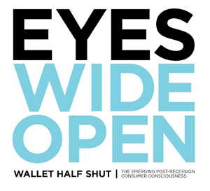
America: Eyes Wide Open, Wallet Half Shut
Like a tempered blade, America has passed through the fires of recession and emerged stronger and sharper, albeit with some pieces of itself permanently oxidized. What is on our minds? How do we feel and how are we acting in the new economy? Researchers at Communispace surveyed more than 1,200 U.S. consumers, spoke with 694 online community members, and came up with some very interesting results and insights. Here they are, in chunky infographic form: [More]
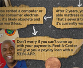
How Predatory Lending Works, From Payday Loans To Rent-To-Own
You’re a savvy, savvy consumer. You pay your credit card bills in full every month, auto-deduct a generous portion of your paycheck into savings, invest in index funds, and always make sure you’re getting the best deal from your cable and wireless providers. Unfortunately, some of your brethren do not read Consumerist and can get caught up in the jaws of predatory lenders, wasting limited cash on things like payday loans, bad credit cards, and using rent-to-own stores. So let’s take a walk down the wild side and see how each of these bad choices work, in a giant infographic, courtesy of Mint and WallStats, after the jump. [More]
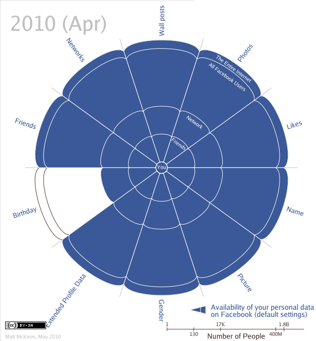
Visualizing The Devolution Of Privacy On Facebook
This chart shows how the default privacy settings on Facebook have gotten less, well, private, from 2005-2010. Created by Matt McKeon based off an EFF timeline, it helps visualize how Facebook has grown increasingly permissive with your data as it has grown in size, power, and revenue. What might tomorrow bring? Perhaps in the future Facebook will create placeholder profiles for people who haven’t signed up yet, using data gleaned from Zabasearch and LexisNexis. Check out Matt’s site for an interactive version.
The Evolution of Privacy on Facebook [mattmckeon via NPR]
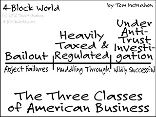
The 3 Kinds Of American Business
According to Tom, there are three basic types of American business. If that’s too many to remember, you can also organize them under them under the umbrella concept known as “screwed up.”
The Three Classes of American Business [4-Block World]
Death And Taxes 2011: Gobsmacking Visual Of Where All Your Tax Dollars Go
Death and Taxes 2011 is here! Jess Bachman is famed for his annual poster where he spends two months researching and creating a visual representation of where your taxes go. The result is a stunning six-foot poster that boggles the mind. Now in it’s 4th year, the poster has over 500 departments, agencies, programs, and whatever else the government can spend money on. “It is still the single most open and accessable record of government spending ever created,” says its creator. After the jump, here is this year’s version in full! [More]
Who Keeps Trying To Kill Our Babies?
This “Recalled Baby Products 2009-2010” graphic from the website hugamonkey is massive, and it shows how many types of products were recalled over the past 16 months. You can use it as a reference tool to see if there’s anything in your home on the list, or to remind yourself why you’d rather have a houseplant. [More]
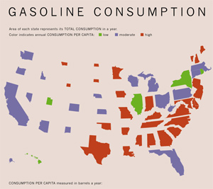
What State Uses The Most Gas?
Is your state the gassiest? This graph over at Infrastructurist compares how much each gas each state uses per person. Green is low use, blue is moderate, and red is high. What’s interesting is when you look at each state’s fuel use per capita, “High-use states like New York actually have low per-capita usage, while states like Alabama, Iowa, Mississippi, Missouri, New Hampshire, and North Dakota — all states with smaller populations and large distances required for drivers — have higher than average consumption.” [More]