Strangely Beautiful Map Shows Territory Controlled In The Fast Food Wars
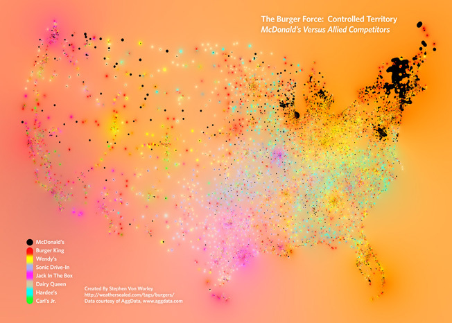
I had always assumed that McDonalds’ hamburger hegemony of the United States, if not the world, was complete. I was wrong. Clearly, I need to leave the Northeast more. The above map shows the dominant burger chains in different parts of the United States. The black dots represent the density of McDonald’s, and other colors represent…everyone else.
A Disturbance In The Force [Weather Sealed] (via Fast Company)
Want more consumer news? Visit our parent organization, Consumer Reports, for the latest on scams, recalls, and other consumer issues.