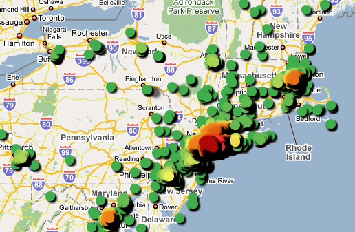
Data is fun. Check out this map with data about the locations of Bernie Madoff‘s victims, color-coded according to the proximity of victims to each other, and in 3-D. Coooool. (Unless you’re one of the victims represented by those shiny, colorful dots, that is.)


