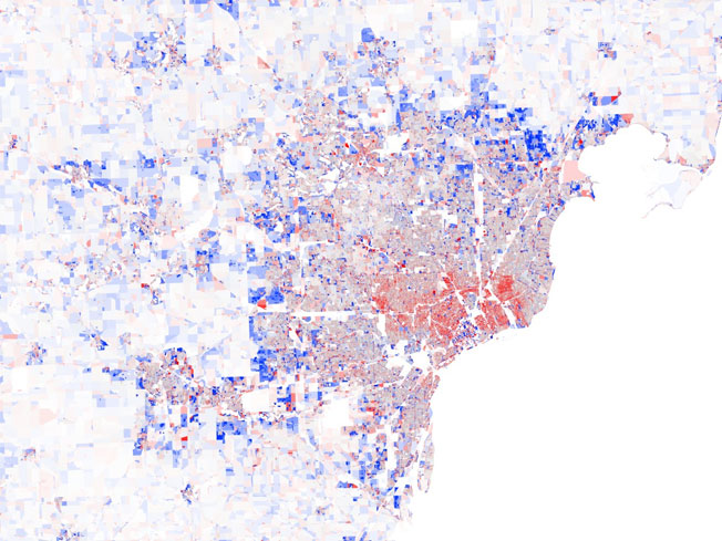
Here’s a series of really nice-looking maps Datapointed made to visualize the 2000-2010 US Census data released this year. The bluer an area, the more people it gained. The redder an area, the more it lost. In the series of maps across America you’ll see urban centers surrounded by a blossom of red, ringed by a halo of blue. It’s the classic “flight to the suburbs” playing out. But one interesting development is the core of cobalt at the heart of these cities where downtown addresses have become in-demand again. Even beleaguered Detroit, as seen in this graph, is showing glimmers of a comeback in its most central neighbs. [More]


