IHOP Changes Logo For First Time In 20 Years Because The Old Version Was Too Frowny
 In a move that literally turns a frown upside down, IHOP has changed its logo for the first time in 20 years. Partly because the old version used a red swoop that was just a bit too sad.
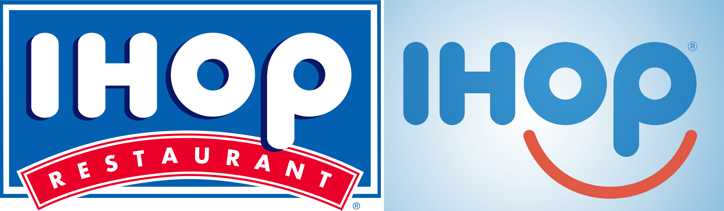
The company found that the red banner “appeared as a person’s frown,” its Vice President of Marketing Kirk Thompson told BuzzFeed News.
That’s not the kind of negative attitude that guests want with their pancakes, he says, echoing statements in the company’s official press release.
“Our guests have told us for many years that coming to IHOP, and in many cases just thinking about our world famous pancakes, makes them smile,” he says in the statement. “We believe this new logo captures the essence of the IHOP experience, which consistently delivers our guests not only craveable food, but also great memories shared with family and friends.”
The new logo will be prominently featured on the IHOP menu, website, mobile app and in advertising signage at select restaurants.
IHOP Changed Its Logo For The First Time In 20 Years [Buzzfeed News]
Want more consumer news? Visit our parent organization, Consumer Reports, for the latest on scams, recalls, and other consumer issues.