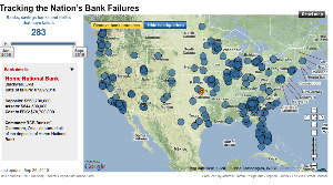
The one joy of WSJ’s otherwise mirthless interactive graph showing bank failures across the country from Jan ’08 to present is that when you slide the time scroller back and forth, it looks like, as Marketplace’s Paddy Hirsch just tweeted, looks like a series of nuclear impact zones. [More]