Urban Outfitters Unveils Snazzy New Logo
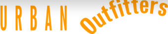
Perhaps jealous of all the publicity The Gap received when it unveiled its dopey, short-lived new logo, Urban Outfitters unveiled this beauty of its own.
What it lacks in symmetry and, well, design skill and effort, it certainly makes up for in orangeness and random curvature.
Next we’ll see whether Urban Outfitters backs down from its revamped look due to public outrage as quickly as quickly as The Gap did.
Urban Outfitters Logo [Urban Outfitters]
Want more consumer news? Visit our parent organization, Consumer Reports, for the latest on scams, recalls, and other consumer issues.