For $27M NYC Turns Caps-Lock Off Street Signs
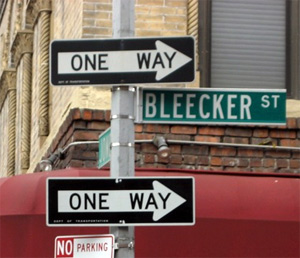
250,900 street signs in New York City will be changed from all-caps to initial caps, where only the first letter is capitalized. The legibility will save lives, say the federal guidelines mandating the change, which will cost the city $27.6 million to implement.
Research has shown that words in all-caps are harder to read and the extra time not looking at the road increases the chance of accidents, especially among older drives.
The font will also change from standard highway to typeface to a newly custom designed one called Clearview, and the signs will have a reflective coating.
States have argued that the increased legibility didn’t justify the cost, so cities are allowed until 2018 for total compliance.
“On the Internet, writing in all caps means you are shouting,” the city Transportation Commissioner told the New York Post. “Our new signs can quiet down, as well.”
$27 million to change NYC signs from all-caps [New York Post]
Want more consumer news? Visit our parent organization, Consumer Reports, for the latest on scams, recalls, and other consumer issues.