Tropicana's Failed Packaging Design Was A Real Life Poochie
The Tropicana redesign disaster seemed strangely familiar to us, and we just now realized why: the Simpsons already did it.
Here’s our highly-researched evidence:
1. Poochie was dreamed up by marketers. The new Tropicana packaging was the result of overpaid marketing types.
2. The new design was vetted by focus groups, which we thought everyone knew by now are absolutely useless. Poochie’s creation is spurred by a focus group of completely unfocused children, including God’s littlest angel, Ralph Wiggum:
Focus Group Guy: [holds his thumb up to the mirror] Now, you each have a knob in front of you. When you like what you see, turn the knob to the right. When you don’t like what you see, turn it left.
Ralph Wiggum: [with his knob in his mouth] My knob tastes funny.
Focus Group Guy: [taking the knob out of Ralph’s mouth] Please refrain from tasting the knob.
I’ve been in a focus group before, and do you know what they give you for being in one? Pizza and money. That’s right, food and cash just for spouting off opinions. You go mad with the power and say anything that comes to mind.
3. Poochie is an amalgamation of cliches and lowest-common-denomitaor buzzwords. The redesigned Tropicana package looks like every generic OJ carton in the juice section.
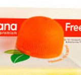
4. The episode introduces a beloved, if flawed, secondary character to the Simpson’s universe. The Tropicana redesign leaves us with a cool little orange-shaped cap that’s fun to look at:
Want more consumer news? Visit our parent organization, Consumer Reports, for the latest on scams, recalls, and other consumer issues.